Google Pay
Making money simple, helpful, and accessible for everyone
My role
Lead UX Designer
Areas of focus
Mobile first website, UX Design, UX Strategy, Wireframes, Research, Interaction design, Storytelling
Industry
Digital payments
In 2021, Google launched a long-anticipated new version of Google Pay in the US. It was critical that Google build a site experience that showcased and positioned this new and improved product in a way that truly resonated with the market. Huge was tasked with the challenge of building a consumer website to be the ultimate source of truth for a suite of new Google Pay 3.0 features, acquire new users, and refresh and own the brand presence.
Create an evolving, human-centric experience that will express that Google Pay is a platform for opportunity.
The concept defines a purpose rooted in an inspiring human truth, elevating the functional points of difference to a compelling emotional promise. We envision the website to be helpful, relatable and engaging to our users - in any moment they open it.
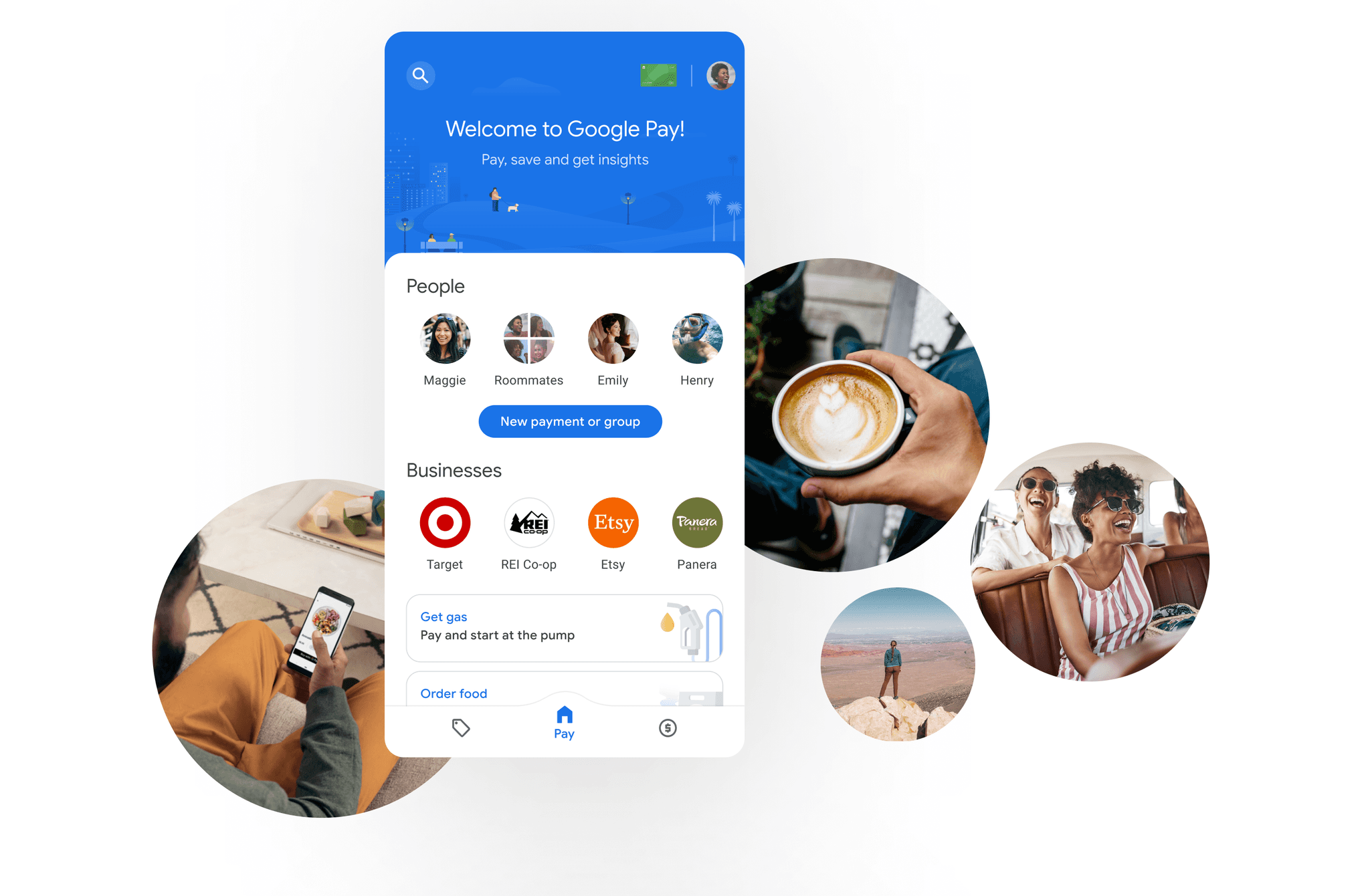
Our main goal was to spotlight the best of Google Pay — group and peer-to-peer payments, online transactions, tap & pay convenience across transit & merchants and the ease and security, privacy, and control of a digital wallet from Google, all based on a chat head conversational UI which makes it simple to find the people and business to pay to.
My team created a comprehensive, mobile-first consumer site to showcase a brand promise that resonates and delivers! I was leading UX while working together with strategists, visual designers, and development teams to build a site that delivered on three main goals:
Invite: Welcome the world to a new relationship with money
Educate: Teach people what’s possible with Google Pay
Enable: Turn the world into a giant user guide on how to use Google Pay
The archetypes
To start building a UX that combines user goals and business goal we took a user centric design approach. During my work I noticed that the website audience needs intersect, but also differ from the app users’ needs.
Needs all our audience shares:
Improve their financial health
Feel empowered and validated
Find reassurance and guidance
From product users to site visitors
We generated user archetypes to describe G Pay’s target audiences and inform product features, messaging, and GTM strategy. Archetypes (or behavioral archetypes) are specific to the website. They describe site visitors to build user flows, IA, page design, and interaction elements.
Crafting the UX
Knowing engagement is a top priority, we created a memorable experience based on 5 experience principles that fully captivates users and achieve its goal:
Effective narrative: the website effectively guides the user through a holistic product narrative that helps them understand how they can benefit from the product and enhance their day.
Interactive and meaningful: we strived to build personalized, interactive and enjoyable experiences that keep users engaged, provide them with meaningful insights/experiences, and finally offer a connection to the app when they want to discover more. I aimed to build an experience which will be worth sharing with friends and will motivate the user to download the app.
Clear and simple messaging: the messaging needed to be simple and help users easily navigate through the rich set of the product feature experience when they want to discover more. So I work closely with UX writers and strategists to make that happen.
Establish design hierarchy: we aimed to build a clear hierarchy of visuals and content that educates the user effortlessly while also showcasing product benefits.
Optimize for acquisitions: whenever the user is ready to try the app, they know exactly how to download it, in that very same moment.
Results
Since GP3 launched the website traffic has increased, scroll rate has also greatly improved from the previous version of the homepage, by nearly 2x and conversion rates have doubled. Reach out to learn more about details, results and the impact we made with this project.
Oi! I'm a Brazilian/Italian designer with over 10 years of experience helping clients in Latin America and US to create experiences that amaze users and grow business. I'm currently at IPSY shaping and enhancing our members’ journey by crafting a seamless and intuitive user experience while flexing my skills as a designer, manager, and thought leader.
My projects impacted more than 1 billion users across the globe and positively helped business and processes. Some of my clients include companies such as Google, Coca-Cola, Siemens and Walmart.
marilucchesi@gmail.com
Find me on Linkedin
Google Pay
Making money simple, helpful, and accessible for everyone
My role
Lead UX Designer
Areas of focus
Mobile first website, UX Design, UX Strategy, Wireframes, Research, Interaction design, Storytelling
Industry
Digital payments
In 2021, Google launched a long-anticipated new version of Google Pay in the US. It was critical that Google build a site experience that showcased and positioned this new and improved product in a way that truly resonated with the market. Huge was tasked with the challenge of building a consumer website to be the ultimate source of truth for a suite of new Google Pay 3.0 features, acquire new users, and refresh and own the brand presence.
Create an evolving, human-centric experience that will express that Google Pay is a platform for opportunity.
The concept defines a purpose rooted in an inspiring human truth, elevating the functional points of difference to a compelling emotional promise. We envision the website to be helpful, relatable and engaging to our users - in any moment they open it.
Our main goal was to spotlight the best of Google Pay — group and peer-to-peer payments, online transactions, tap & pay convenience across transit & merchants and the ease and security, privacy, and control of a digital wallet from Google, all based on a chat head conversational UI which makes it simple to find the people and business to pay to.
My team created a comprehensive, mobile-first consumer site to showcase a brand promise that resonates and delivers! I was leading UX while working together with strategists, visual designers, and development teams to build a site that delivered on three main goals:
Invite: Welcome the world to a new relationship with money
Educate: Teach people what’s possible with Google Pay
Enable: Turn the world into a giant user guide on how to use Google Pay
The archetypes
To start building a UX that combines user goals and business goal we took a user centric design approach. During my work I noticed that the website audience needs intersect, but also differ from the app users’ needs.
Needs all our audience shares:
Improve their financial health
Feel empowered and validated
Find reassurance and guidance
From product users to site visitors
We generated user archetypes to describe G Pay’s target audiences and inform product features, messaging, and GTM strategy. Archetypes (or behavioral archetypes) are specific to the website. They describe site visitors to build user flows, IA, page design, and interaction elements.
Crafting the UX
Knowing engagement is a top priority, we created a memorable experience based on 5 experience principles that fully captivates users and achieve its goal:
Effective narrative: the website effectively guides the user through a holistic product narrative that helps them understand how they can benefit from the product and enhance their day.
Interactive and meaningful: we strived to build personalized, interactive and enjoyable experiences that keep users engaged, provide them with meaningful insights/experiences, and finally offer a connection to the app when they want to discover more. I aimed to build an experience which will be worth sharing with friends and will motivate the user to download the app.
Clear and simple messaging: the messaging needed to be simple and help users easily navigate through the rich set of the product feature experience when they want to discover more. So I work closely with UX writers and strategists to make that happen.
Establish design hierarchy: we aimed to build a clear hierarchy of visuals and content that educates the user effortlessly while also showcasing product benefits.
Optimize for acquisitions: whenever the user is ready to try the app, they know exactly how to download it, in that very same moment.
Results
Since GP3 launched the website traffic has increased, scroll rate has also greatly improved from the previous version of the homepage, by nearly 2x and conversion rates have doubled. Reach out to learn more about details, results and the impact we made with this project.
Oi! I'm a Brazilian/Italian designer with over 10 years of experience helping clients in Latin America and US to create experiences that amaze users and grow business. I'm currently at IPSY shaping and enhancing our members’ journey by crafting a seamless and intuitive user experience while flexing my skills as a designer, manager, and thought leader.
My projects impacted more than 1 billion users across the globe and positively helped business and processes. Some of my clients include companies such as Google, Coca-Cola, Siemens and Walmart.
marilucchesi@gmail.com
Find me on Linkedin
Google Pay
Making money simple, helpful, and accessible for everyone
My role
Lead UX Designer
Areas of focus
Mobile first website, UX Design, UX Strategy, Wireframes, Research, Interaction design, Storytelling
Industry
Digital payments
In 2021, Google launched a long-anticipated new version of Google Pay in the US. It was critical that Google build a site experience that showcased and positioned this new and improved product in a way that truly resonated with the market. Huge was tasked with the challenge of building a consumer website to be the ultimate source of truth for a suite of new Google Pay 3.0 features, acquire new users, and refresh and own the brand presence.
Create an evolving, human-centric experience that will express that Google Pay is a platform for opportunity.
The concept defines a purpose rooted in an inspiring human truth, elevating the functional points of difference to a compelling emotional promise. We envision the website to be helpful, relatable and engaging to our users - in any moment they open it.
Our main goal was to spotlight the best of Google Pay — group and peer-to-peer payments, online transactions, tap & pay convenience across transit & merchants and the ease and security, privacy, and control of a digital wallet from Google, all based on a chat head conversational UI which makes it simple to find the people and business to pay to.
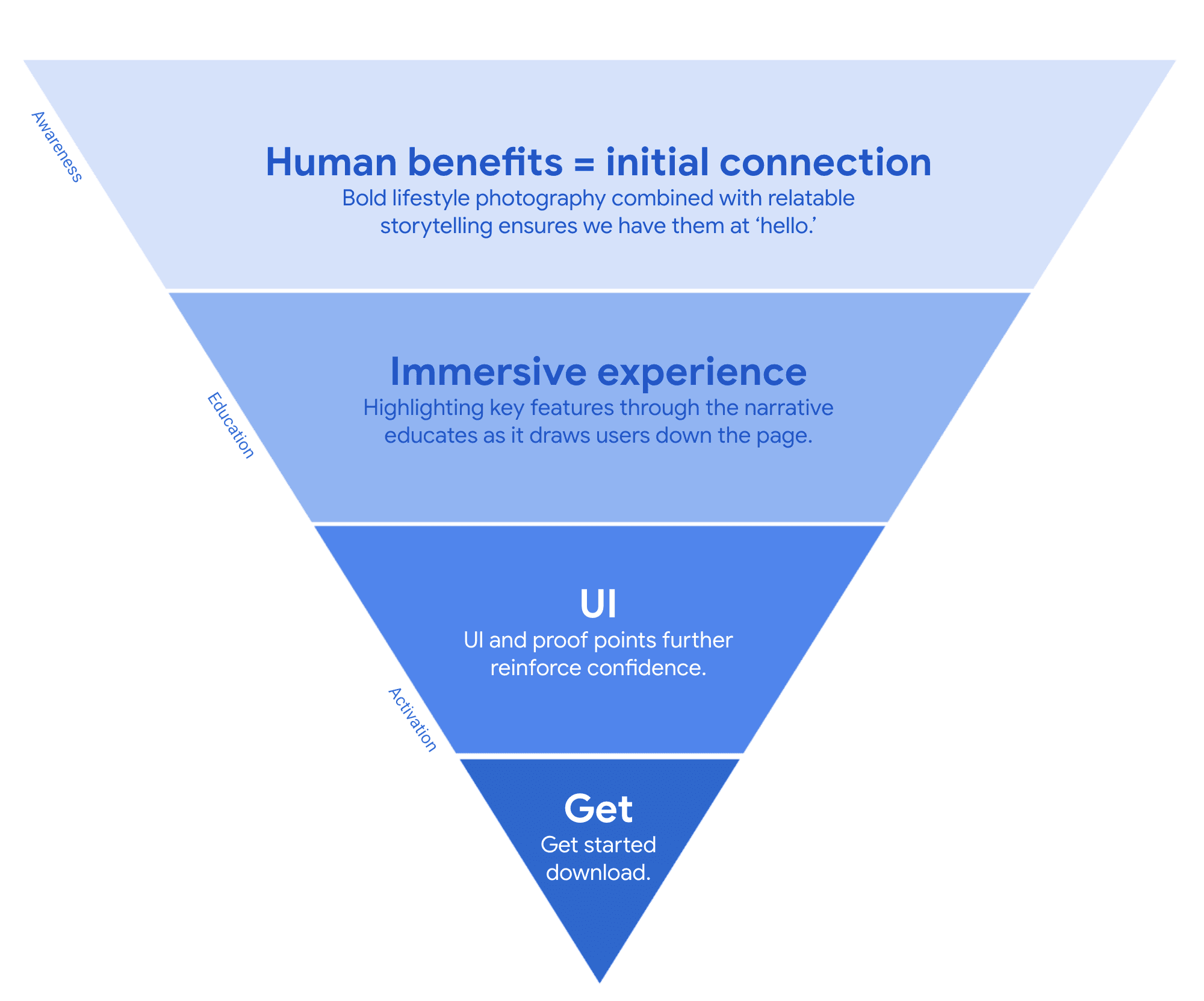
My team created a comprehensive, mobile-first consumer site to showcase a brand promise that resonates and delivers! I was leading UX while working together with strategists, visual designers, and development teams to build a site that delivered on three main goals:
Invite: Welcome the world to a new relationship with money
Educate: Teach people what’s possible with Google Pay
Enable: Turn the world into a giant user guide on how to use Google Pay
The archetypes
To start building a UX that combines user goals and business goal we took a user centric design approach. During my work I noticed that the website audience needs intersect, but also differ from the app users’ needs.
Needs all our audience shares:
Improve their financial health
Feel empowered and validated
Find reassurance and guidance
From product users to site visitors
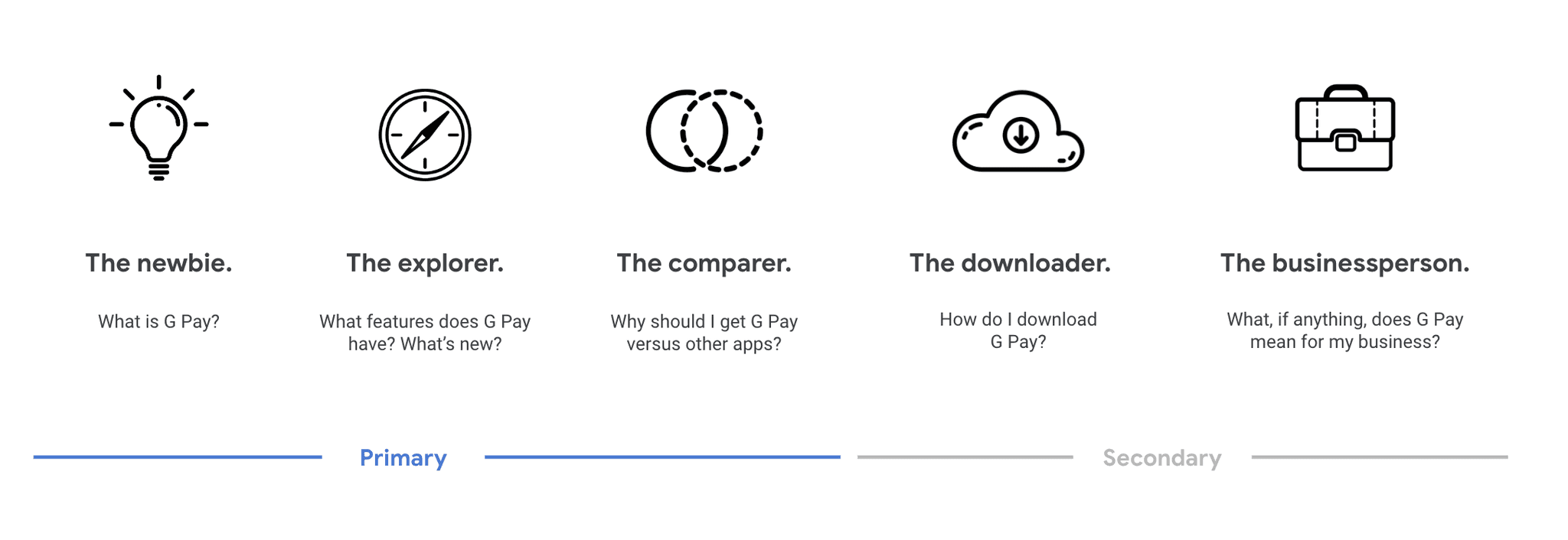
We generated user archetypes to describe G Pay’s target audiences and inform product features, messaging, and GTM strategy. Archetypes (or behavioral archetypes) are specific to the website. They describe site visitors to build user flows, IA, page design, and interaction elements.
Crafting the UX
Knowing engagement is a top priority, we created a memorable experience based on 5 experience principles that fully captivates users and achieve its goal:
Effective narrative: the website effectively guides the user through a holistic product narrative that helps them understand how they can benefit from the product and enhance their day.
Interactive and meaningful: we strived to build personalized, interactive and enjoyable experiences that keep users engaged, provide them with meaningful insights/experiences, and finally offer a connection to the app when they want to discover more. I aimed to build an experience which will be worth sharing with friends and will motivate the user to download the app.
Clear and simple messaging: the messaging needed to be simple and help users easily navigate through the rich set of the product feature experience when they want to discover more. So I work closely with UX writers and strategists to make that happen.
Establish design hierarchy: we aimed to build a clear hierarchy of visuals and content that educates the user effortlessly while also showcasing product benefits.
Optimize for acquisitions: whenever the user is ready to try the app, they know exactly how to download it, in that very same moment.
Results
Since GP3 launched the website traffic has increased, scroll rate has also greatly improved from the previous version of the homepage, by nearly 2x and conversion rates have doubled. Reach out to learn more about details, results and the impact we made with this project.
Oi! I'm a Brazilian/Italian designer with over 10 years of experience helping clients in Latin America and US to create experiences that amaze users and grow business. I'm currently at IPSY shaping and enhancing our members’ journey by crafting a seamless and intuitive user experience while flexing my skills as a designer, manager, and thought leader.
My projects impacted more than 1 billion users across the globe and positively helped business and processes. Some of my clients include companies such as Google, Coca-Cola, Siemens and Walmart.